Package Design
Caribbean Azur
Project roles: Brand Identity Design, Packaging Design, Visual System Development, Creative Direction
Project timeline: One month
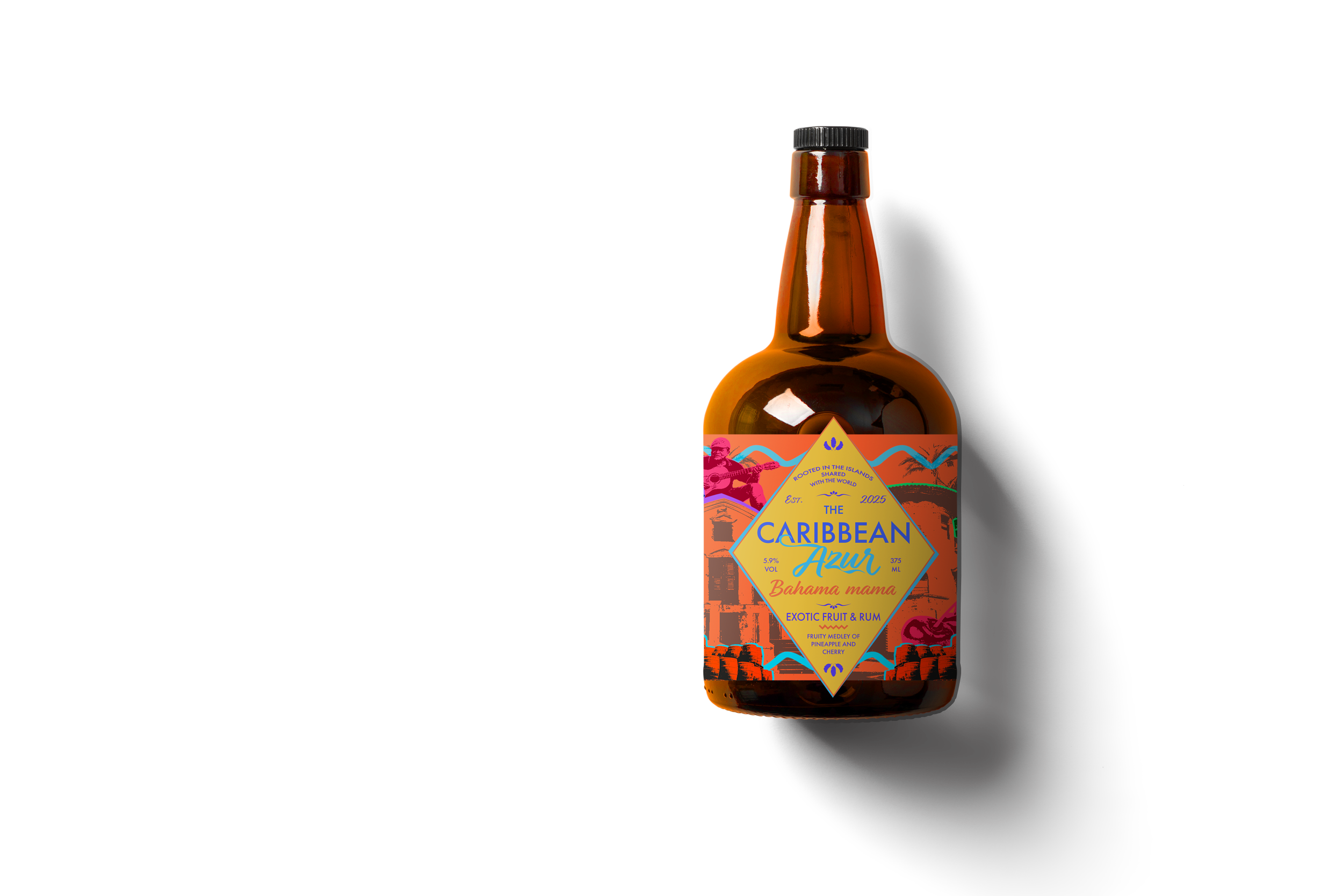
A rum packaging system designed as a cultural exploration—using vibrant, location-based identities to celebrate Caribbean regions through a unified brand.
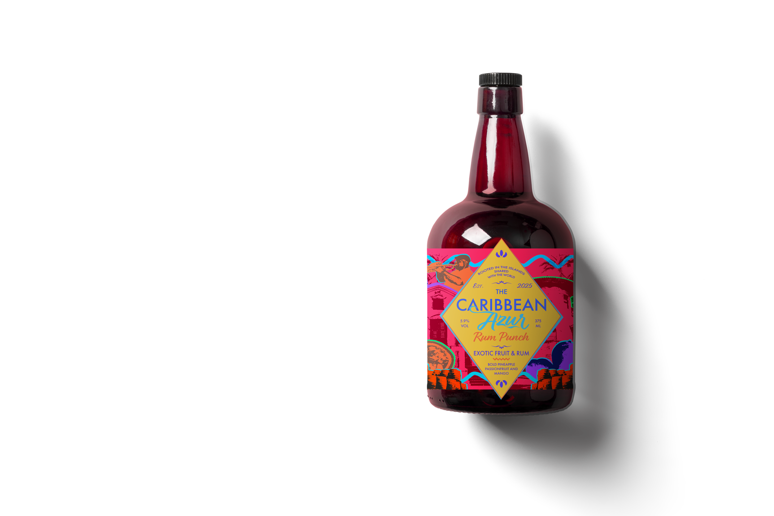
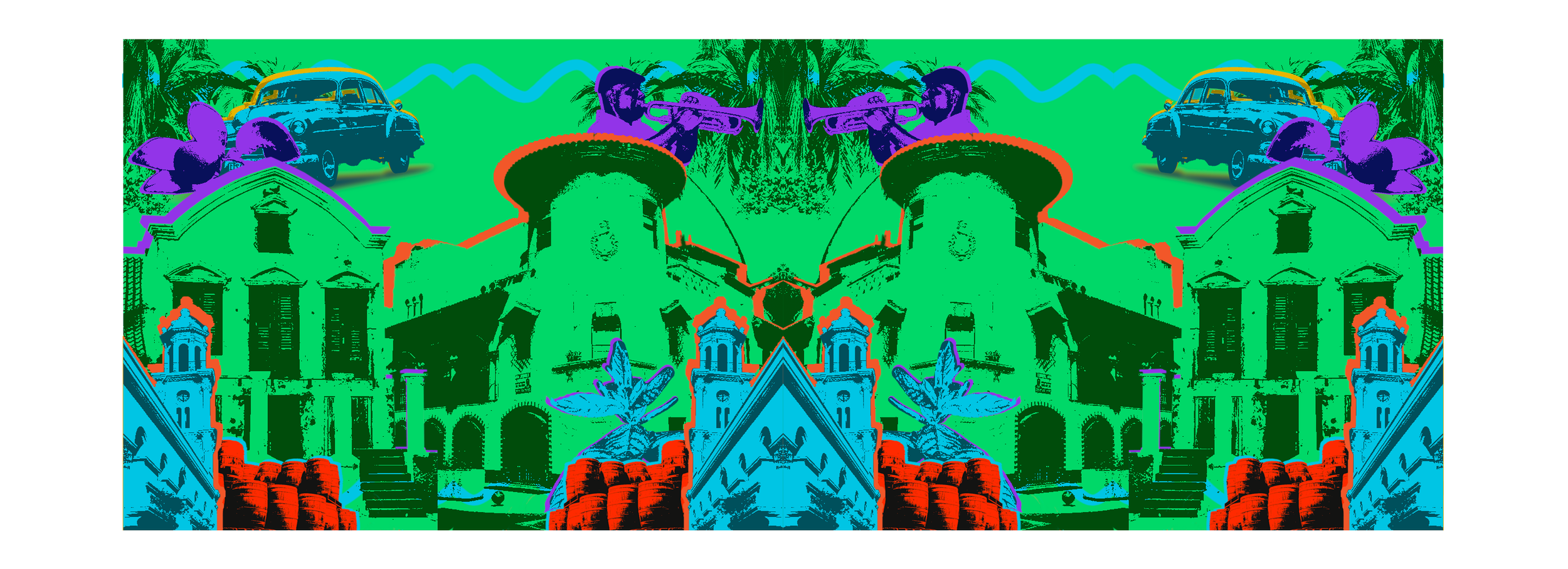
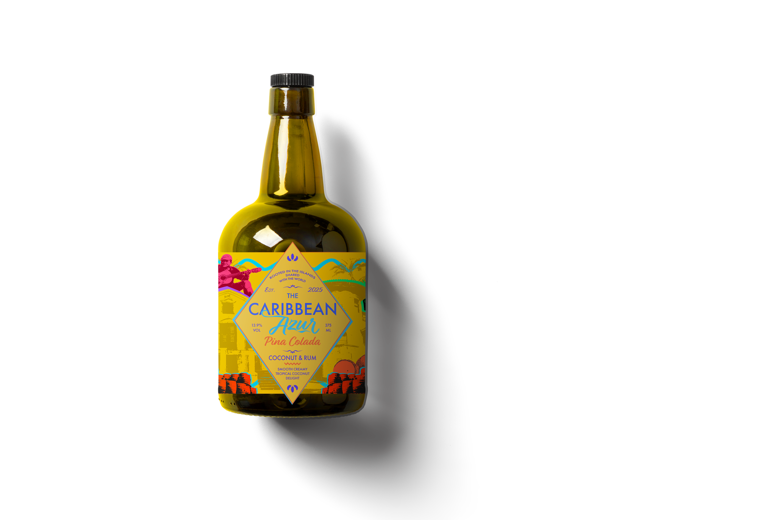
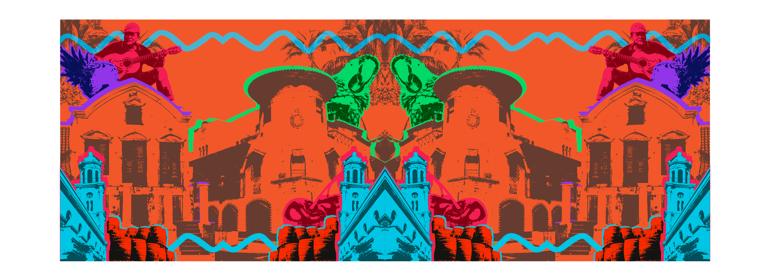
Problem
Many rum brands rely on generalized tropical aesthetics, reducing diverse Caribbean cultures into a single visual language.
This lack of specificity limits both cultural representation and consumer engagement—especially for tourists seeking a more meaningful connection to the places they visit.
Concept
The Caribbean is not a singular identity—it’s a collection of distinct cultures, environments, and experiences.
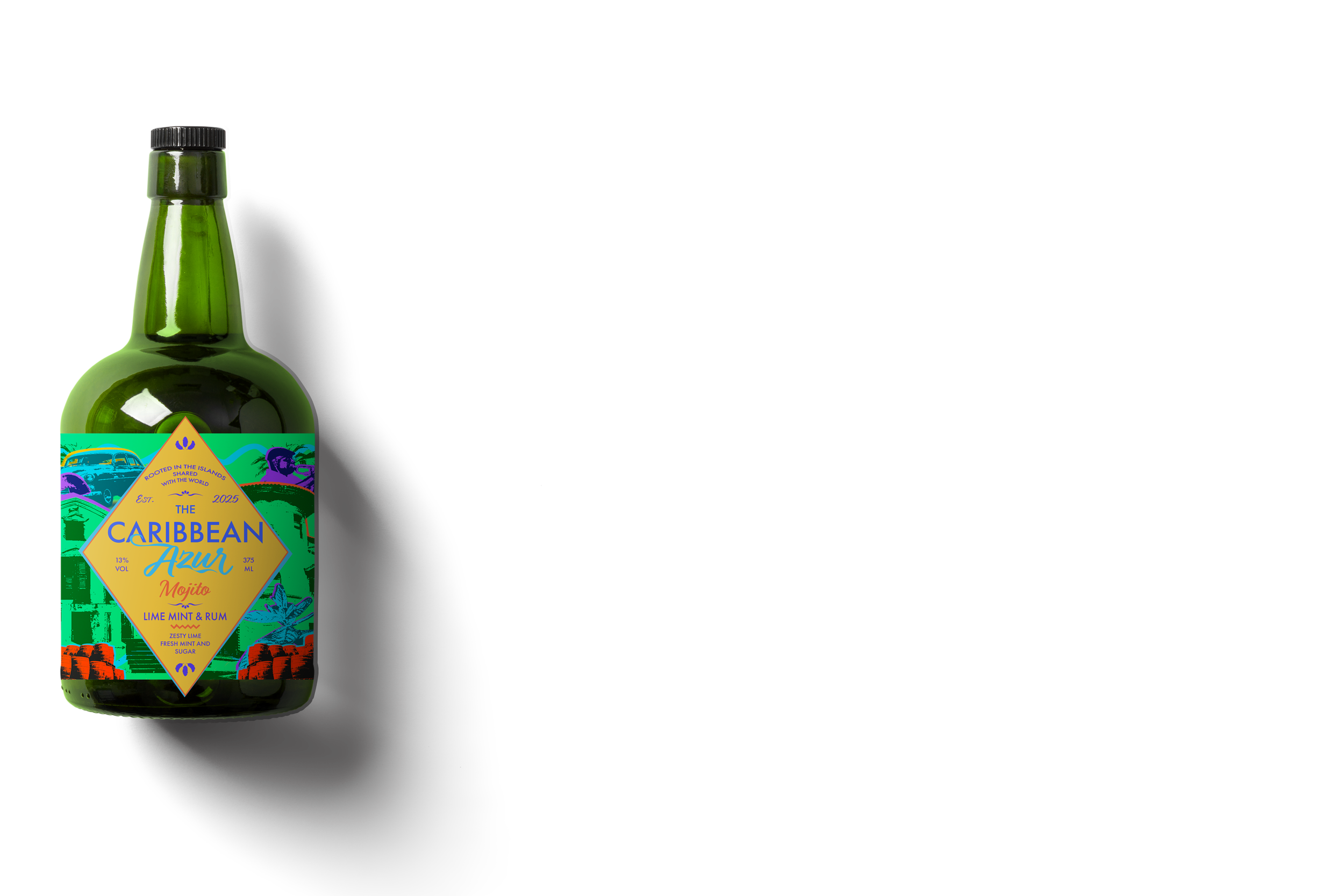
By treating each bottle as a location, the packaging becomes a system of exploration—encouraging consumers to engage with the diversity of the region rather than a simplified version of it.
Approach
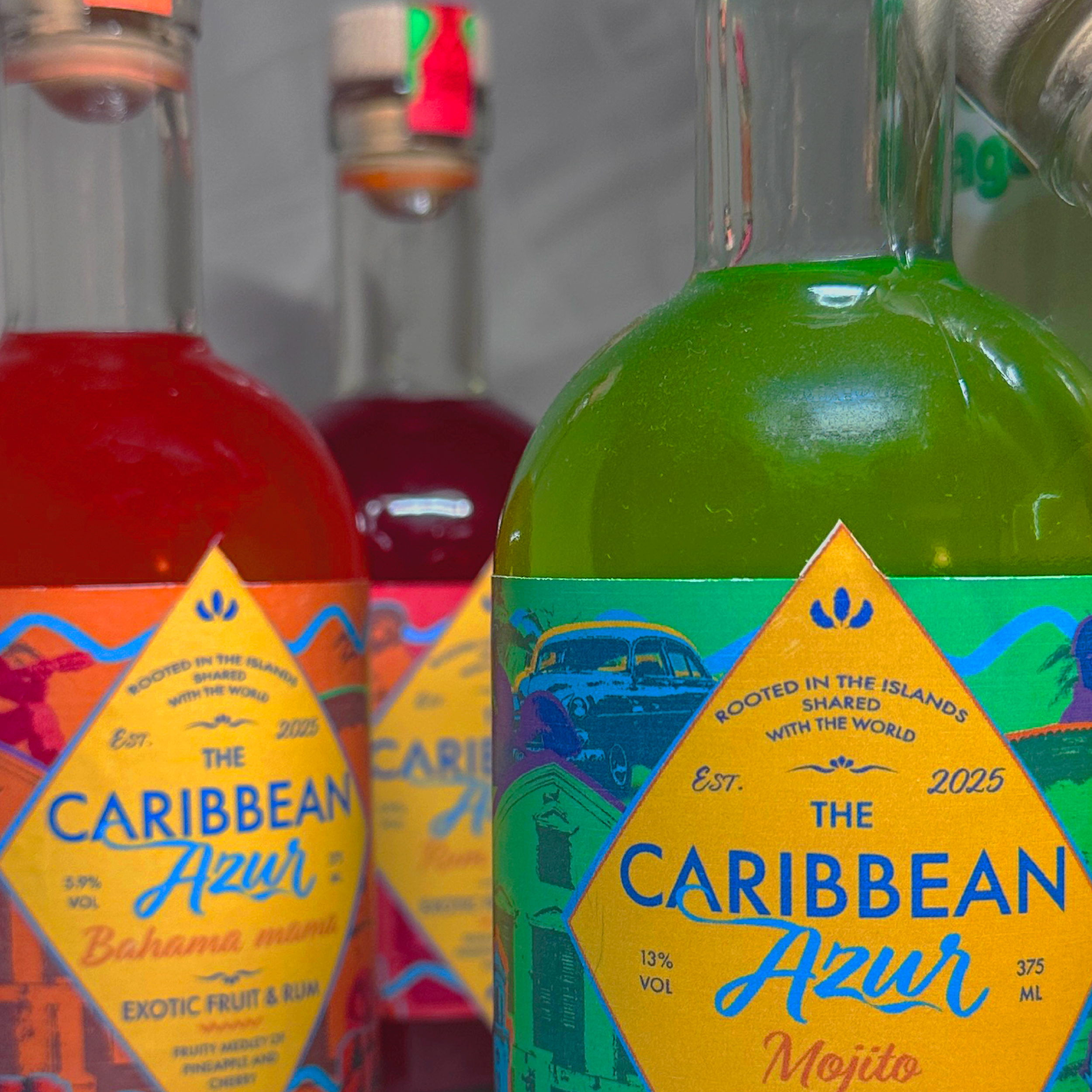
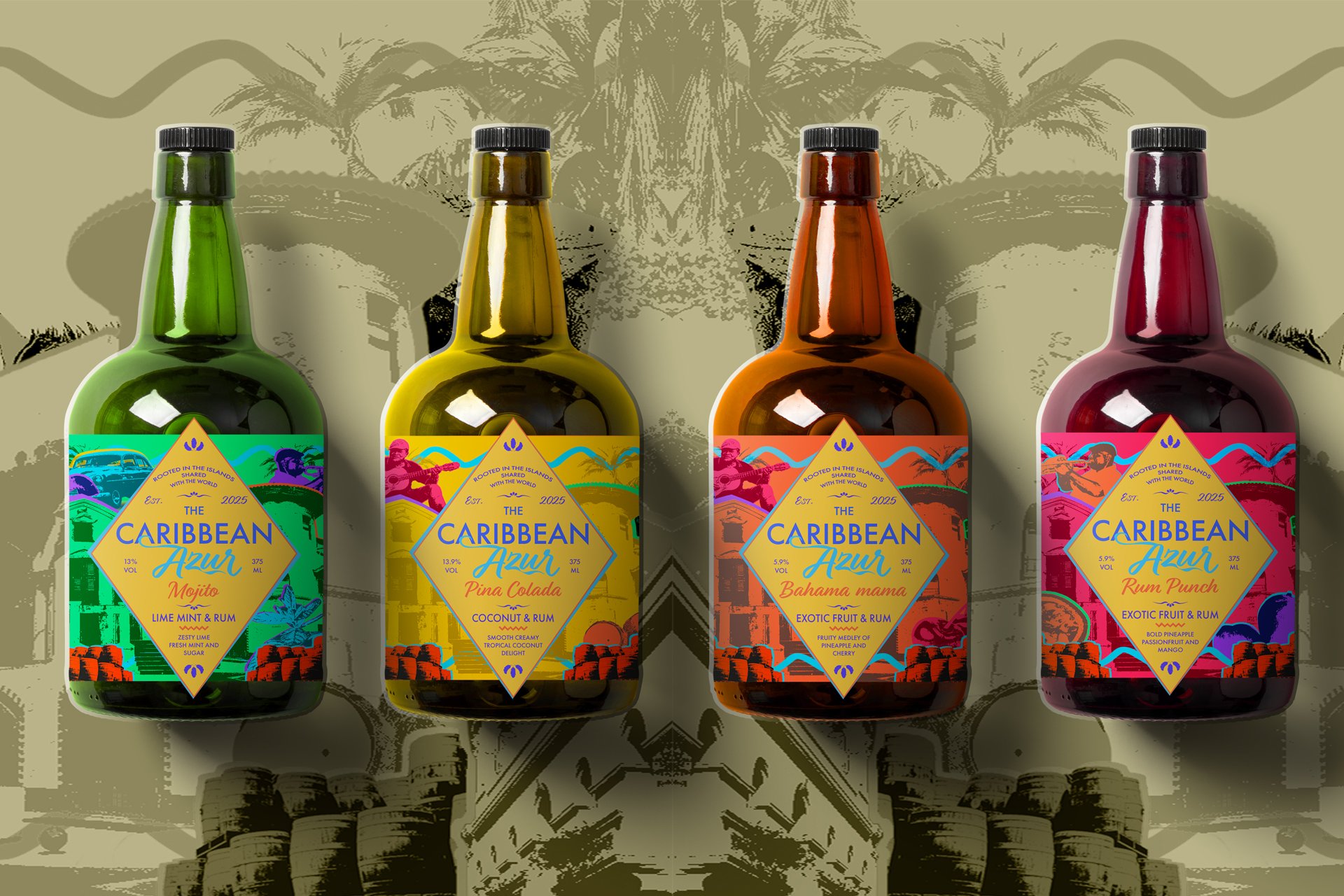
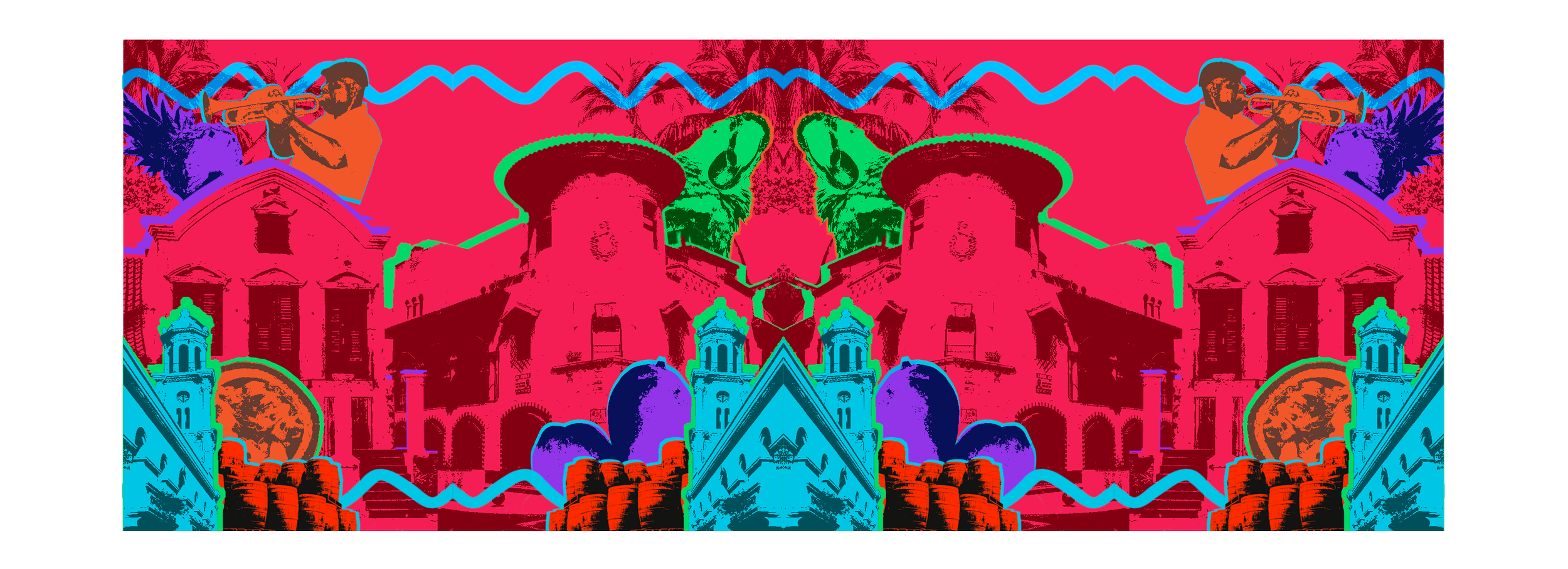
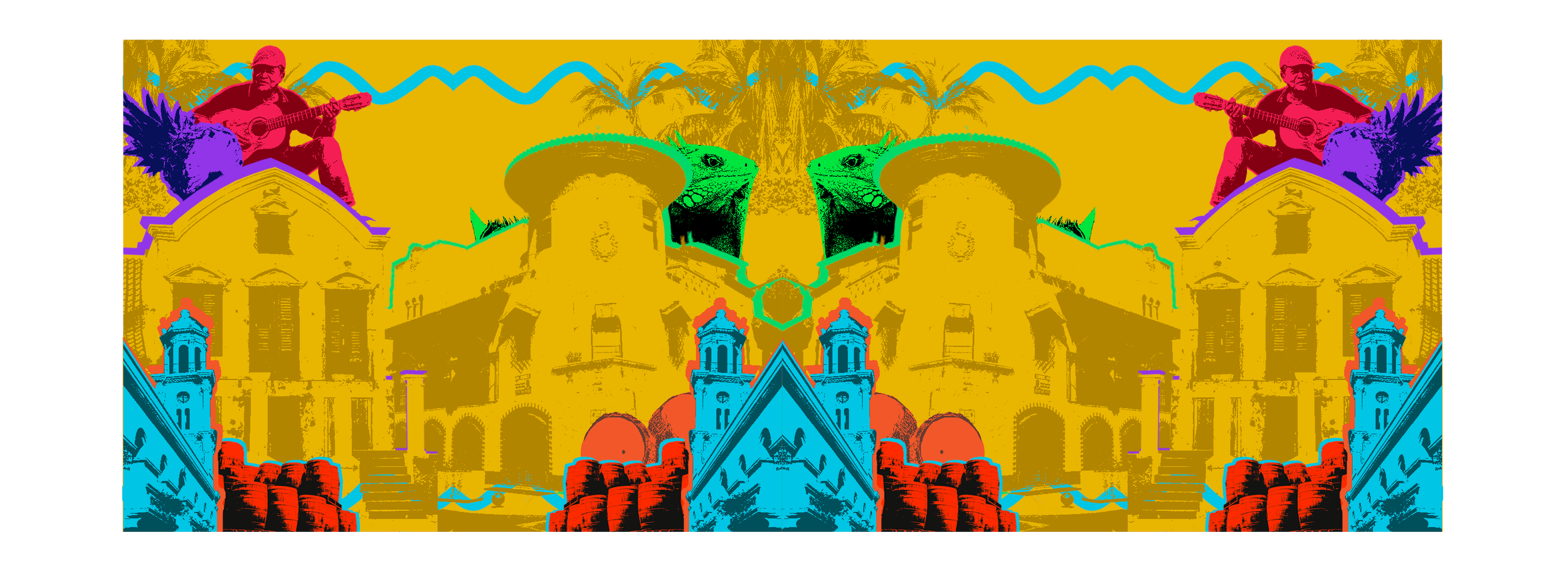
The brand system is built around four unique locations: the Dominican Republic, Jamaica, Cuba, and the Bahamas.
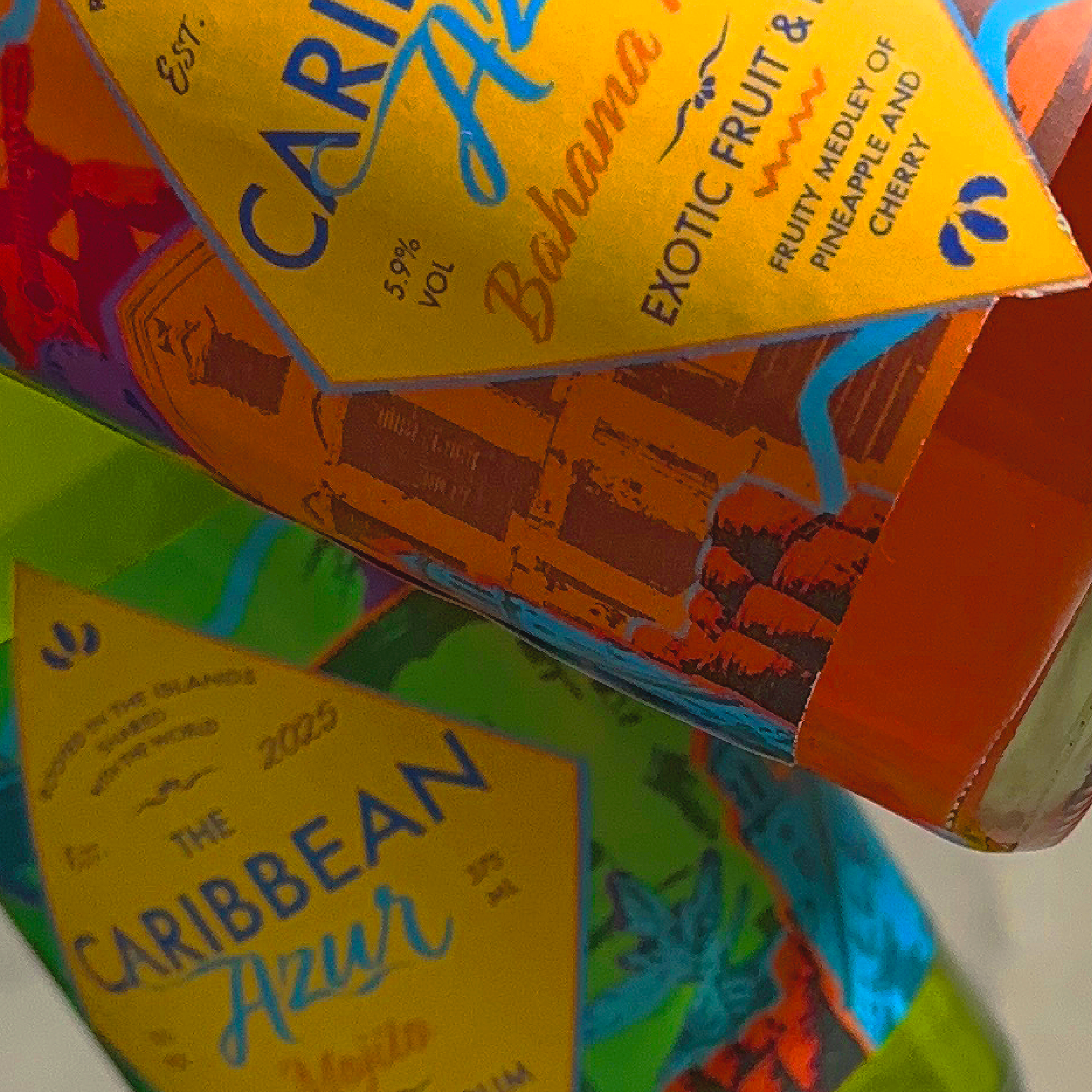
Developed distinct pattern systems for each bottle, inspired by the cultural and environmental characteristics of each location
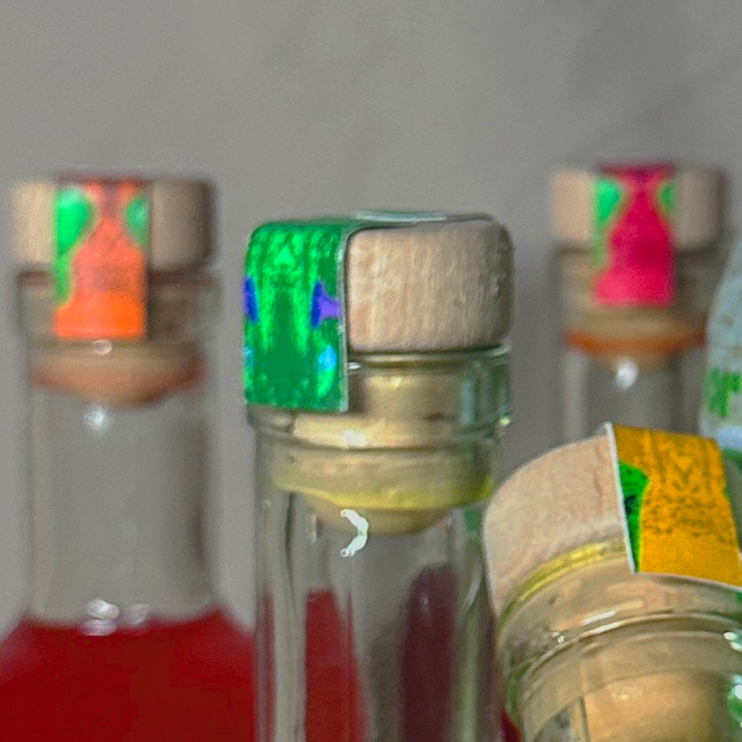
Used vibrant color palettes to reflect the energy and atmosphere of Caribbean life
Focused on composition and assembly to unify the variations into a cohesive brand system
Designed each label to function individually while contributing to a larger narrative of exploration
Balanced playfulness with structure to maintain clarity and shelf presence
Outcome / Impact
The packaging transforms the product into an experience—positioning Caribbean Azur as a brand rooted in discovery, celebration, and cultural appreciation.
By highlighting distinct locations, the system encourages engagement beyond the product itself, appealing to tourists and consumers interested in exploring and connecting with the cultures represented.
Reflection
This project reinforced the importance of designing with cultural awareness and intention.
Developing a system across multiple variations required balancing consistency with individuality, while ensuring each design remained respectful, engaging, and visually distinct. It strengthened my ability to translate place-based inspiration into a cohesive and scalable brand identity.